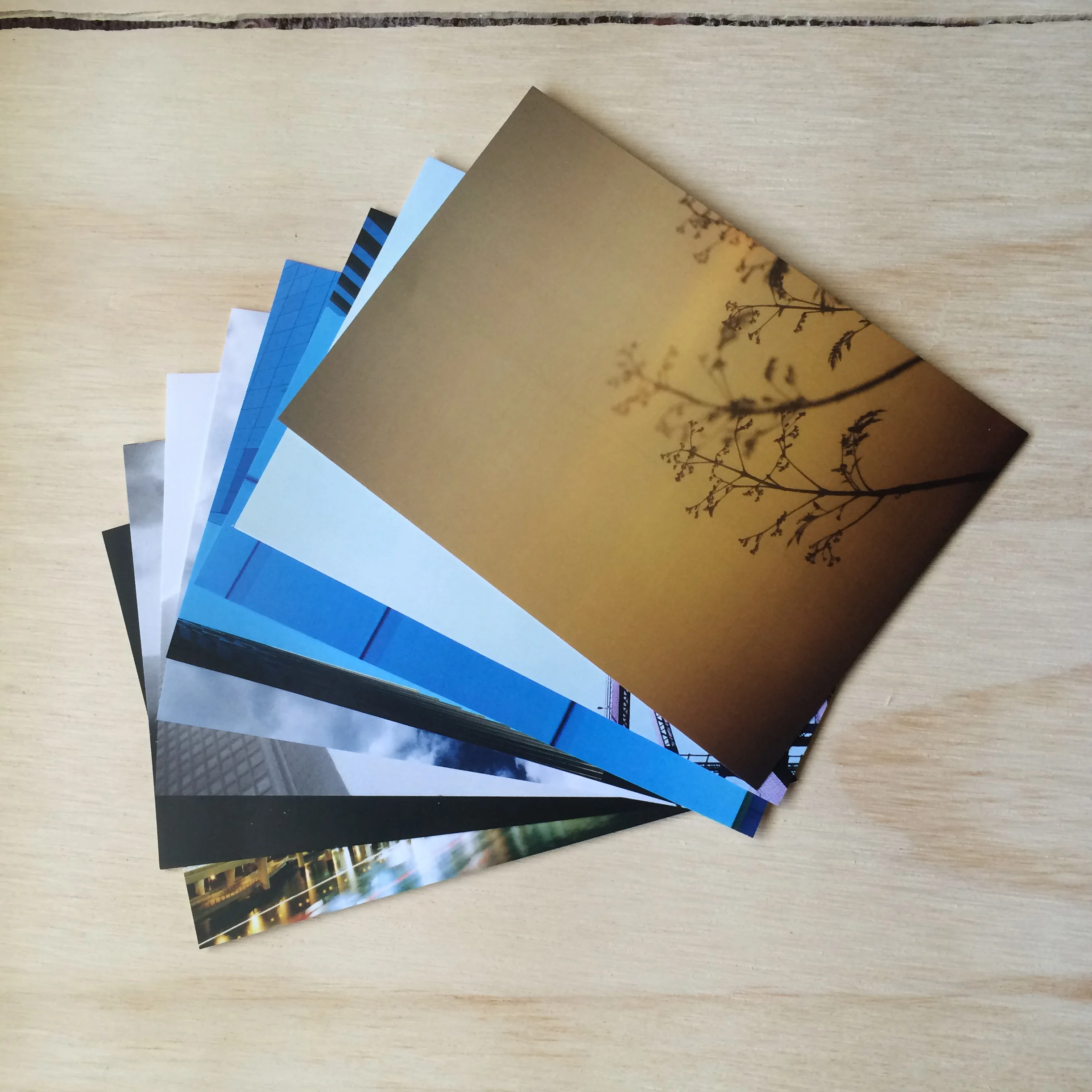
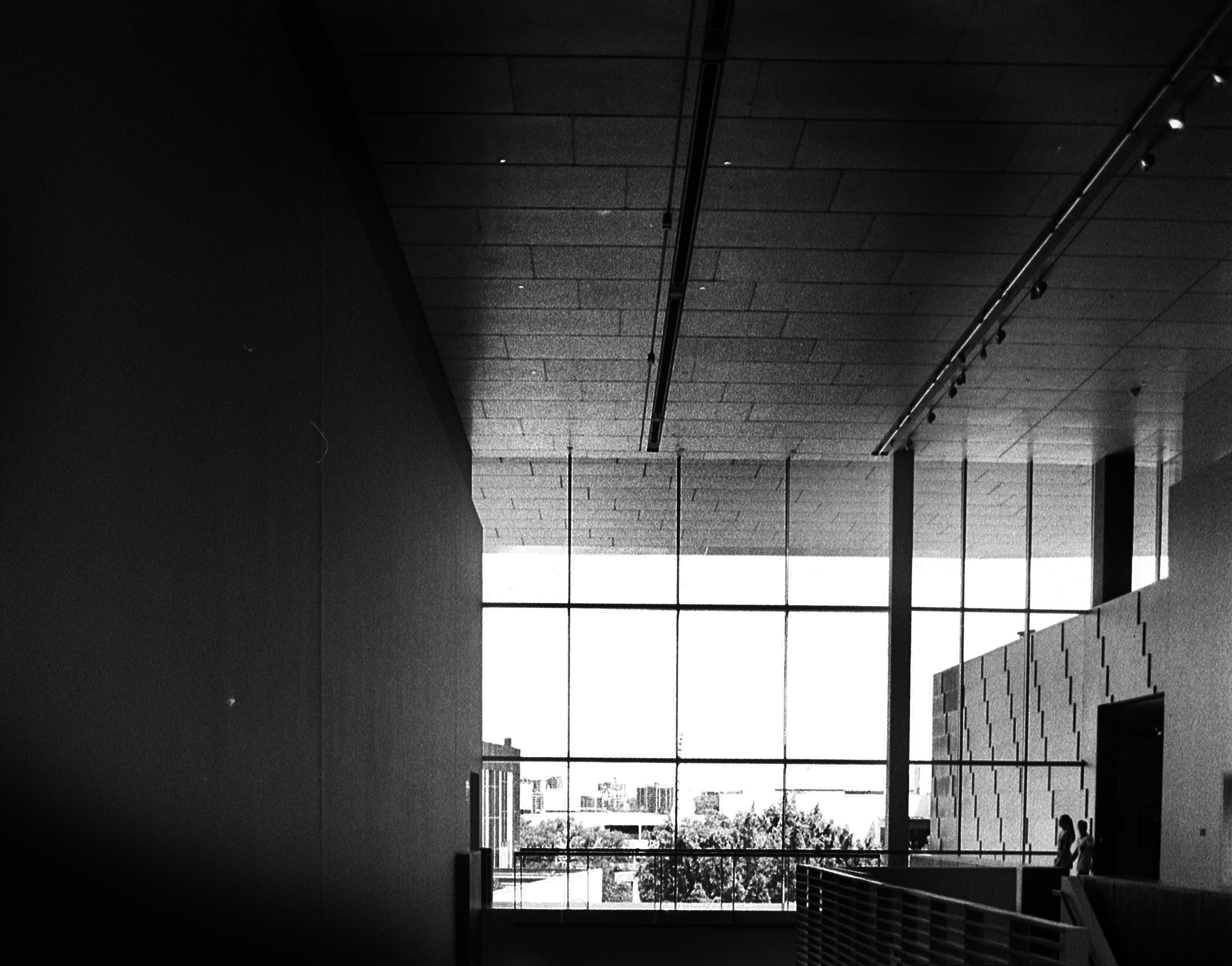
Postcard Collection - Brisbane.

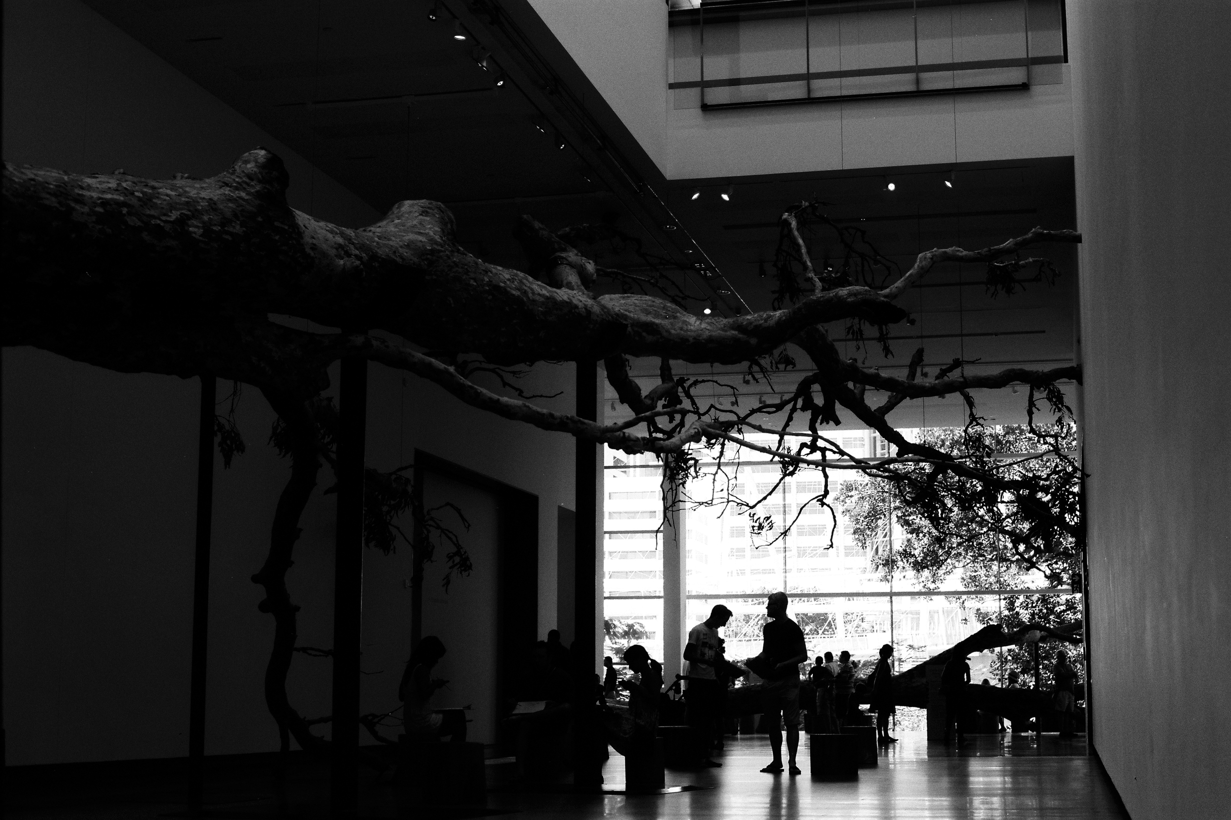
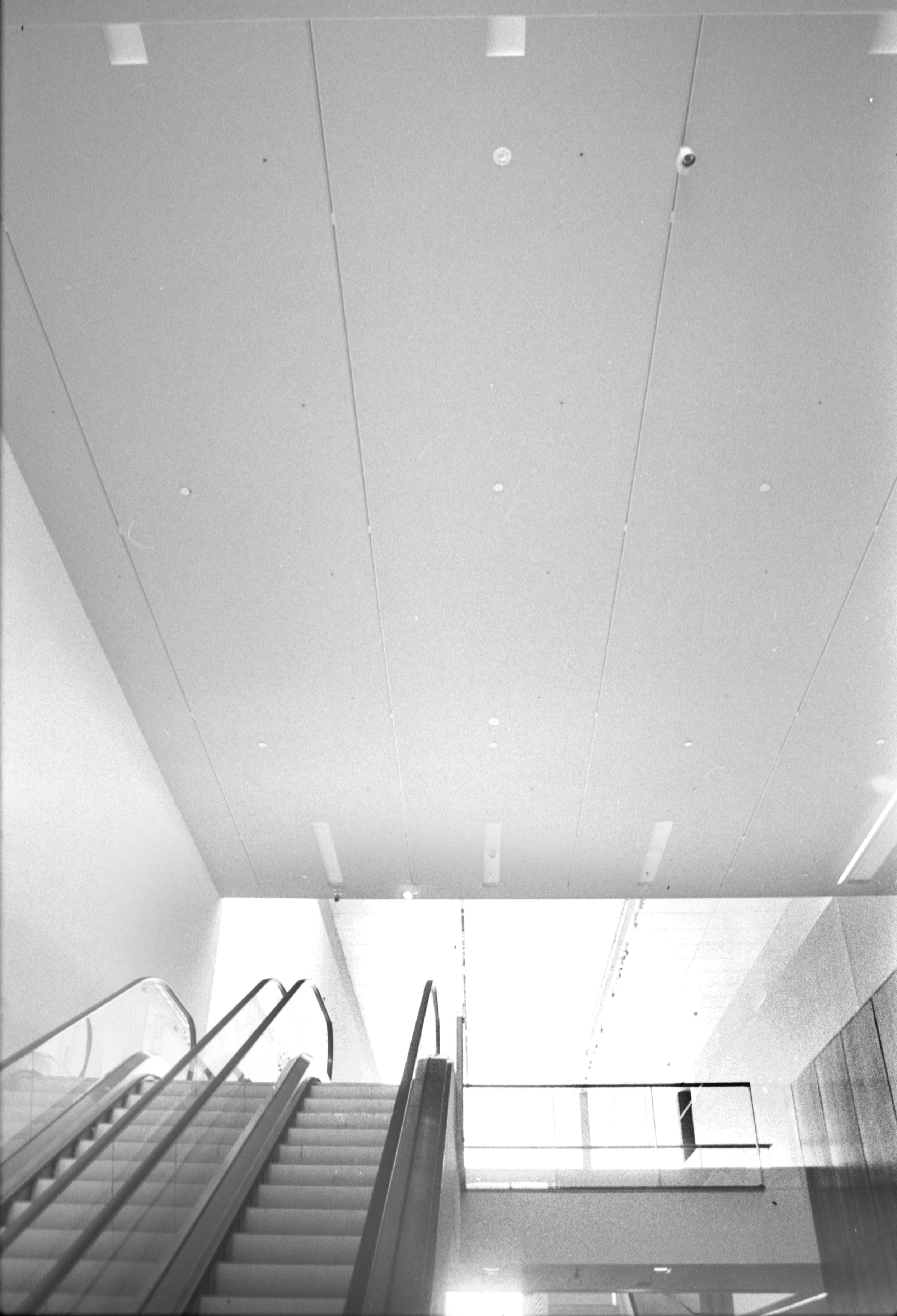
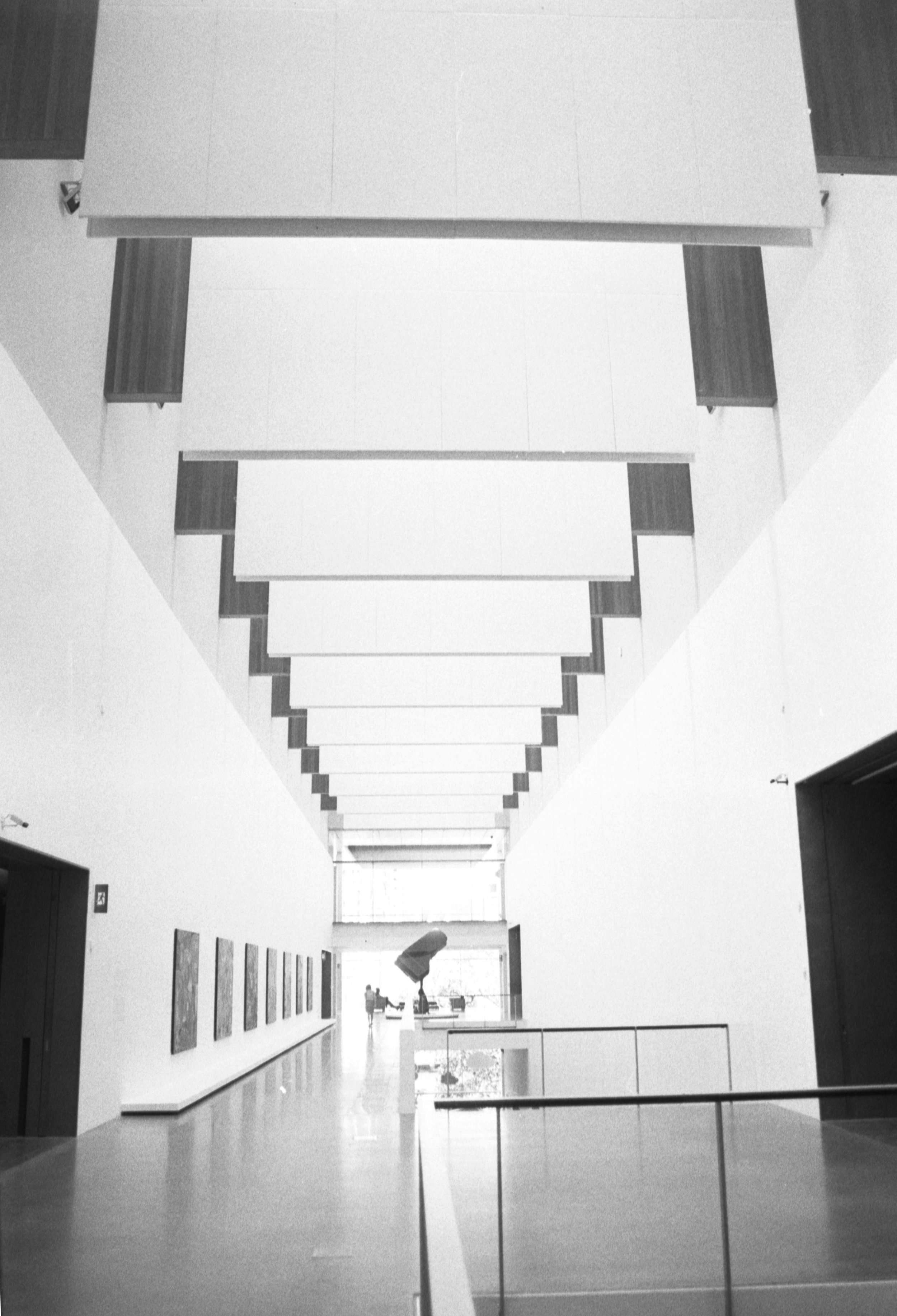
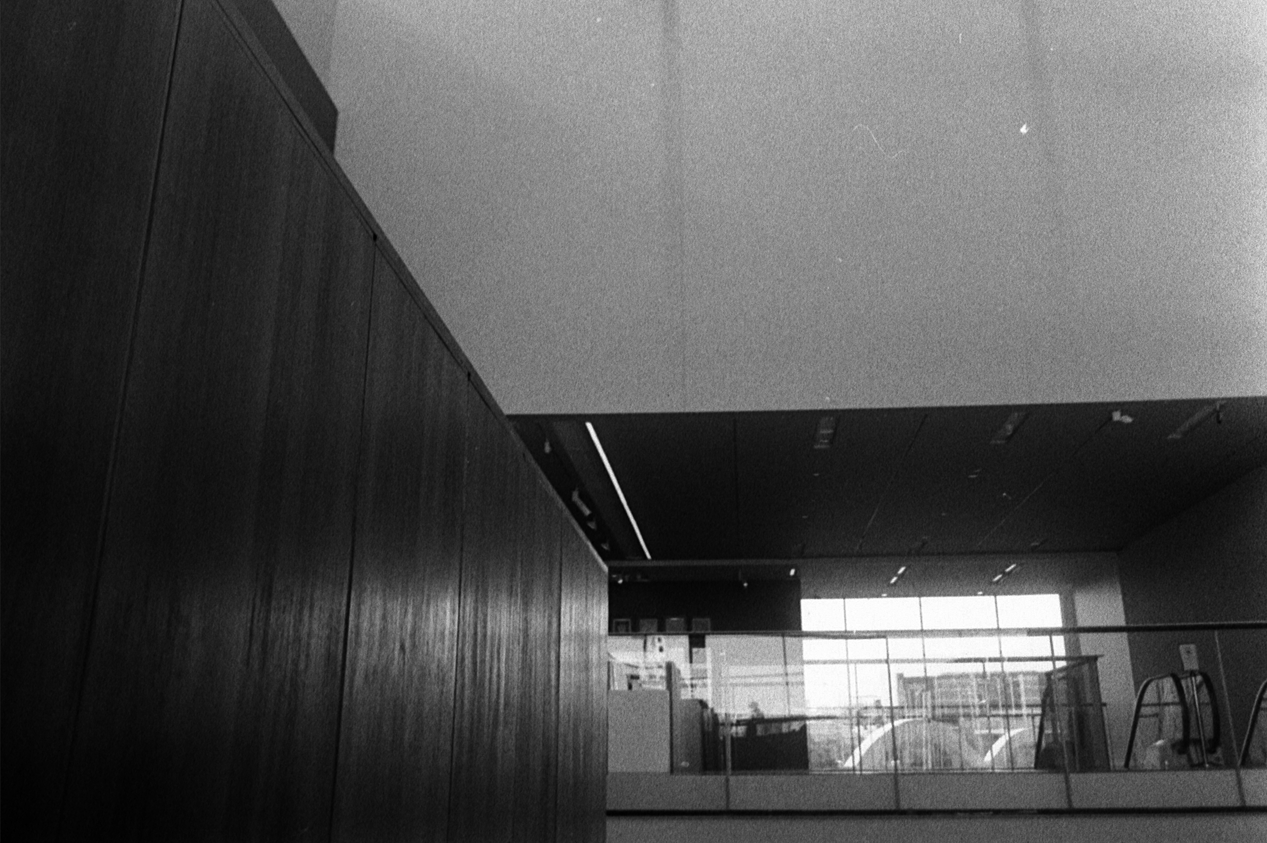
Something new! Available now, postcards of some of Brisbane's iconic (and perhaps not-so) places. Some favourite places of mine around town from my point of view. Be it Kangaroo Point (golden silhouette) or the Clock Tower atop City Hall.

Available for purchase for $2.50 / each (in postage and handling in an envelop). Printed here in Brisbane #supportlocal

If you'd like to buy a tonne of them or if there is particular image you'd like., holla. Currently available online. If you or someone you know would like to stock them, please get in touch.

A Curation of a Curation.

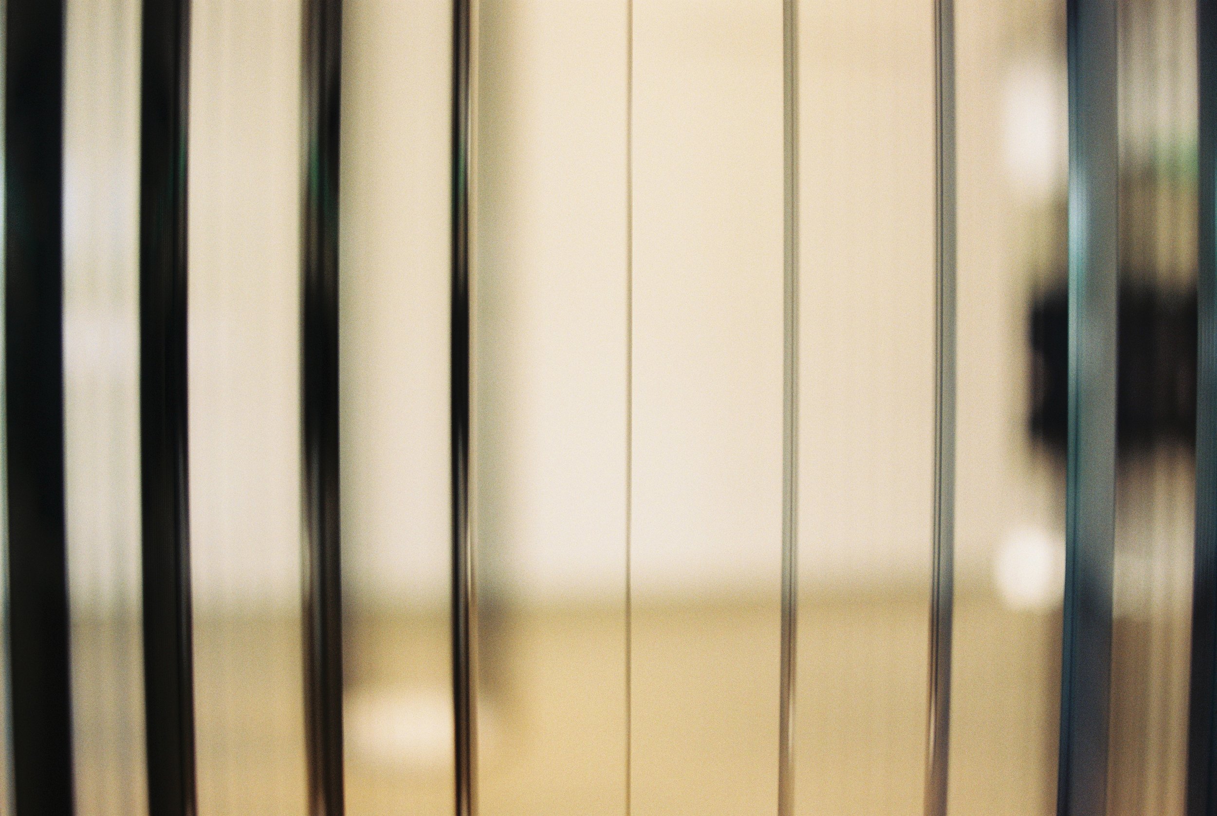
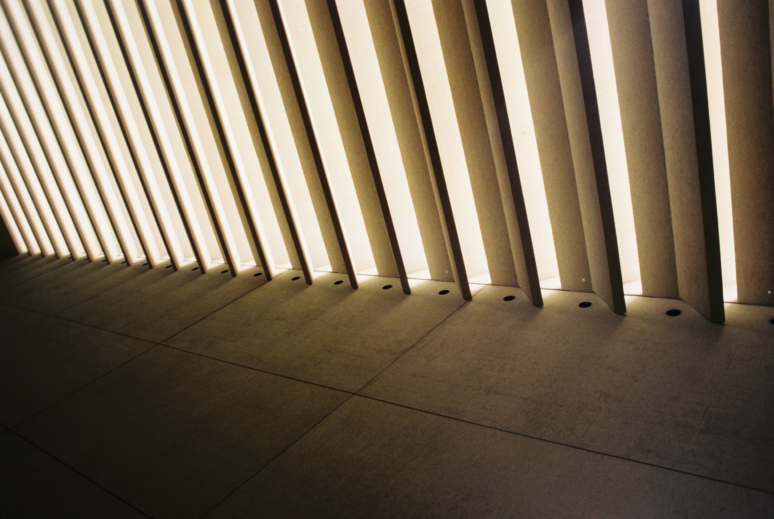
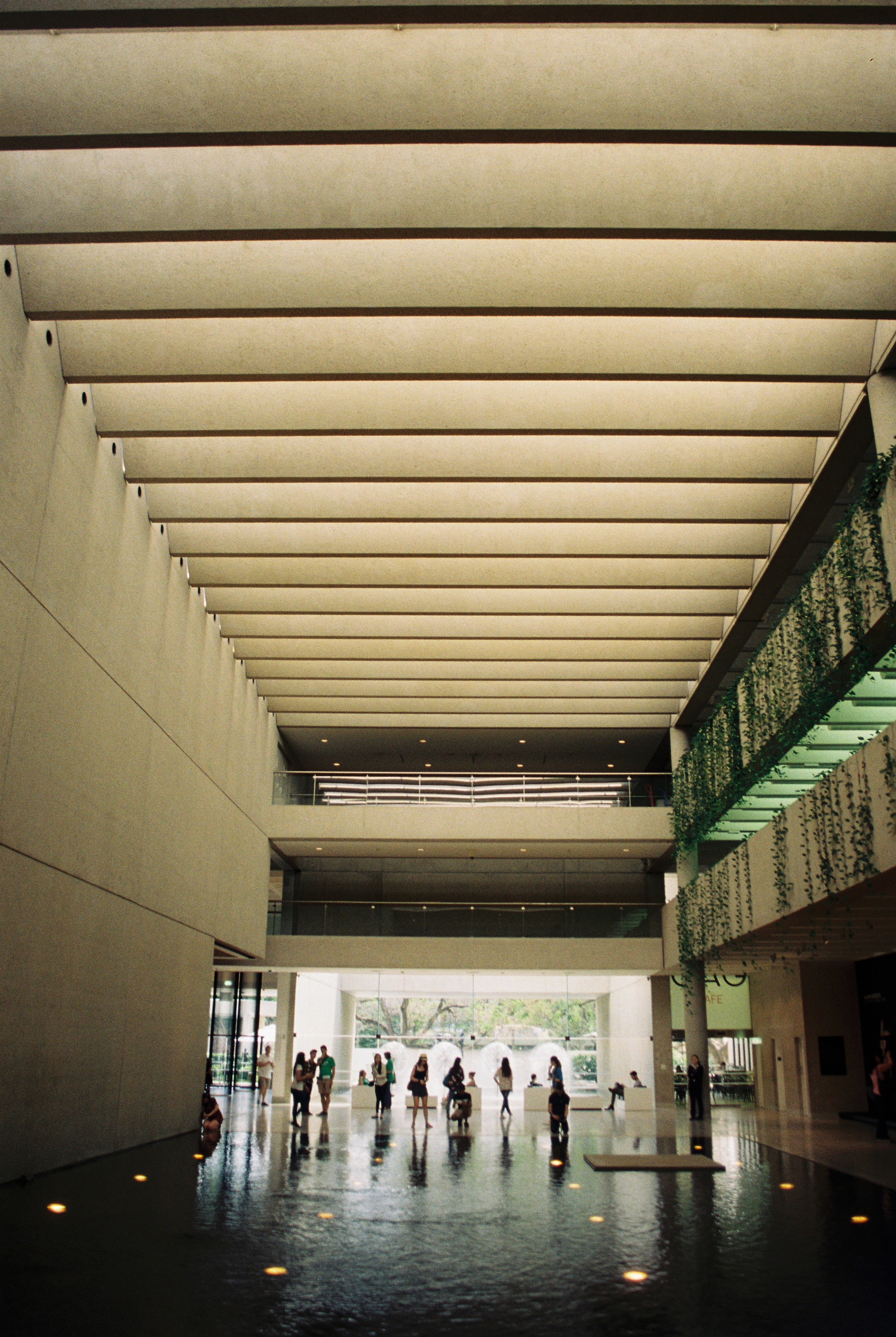
One of my favourite places to visit is the QAGOMA (Queensland Art Gallery of Modern Art).

With regular special interest exhibitions and with an always eclectic mix of art on display from both locally and abroad. I remember as a I child visiting with my family, the dinosaurs out front and the model car complete with working engine were my favourites (in the original Queensland Art Gallery). More recently, with the addition of the Modern extension opening in 2006.

Lines, structure, form and function, bathed with lots of natural light. Both buildings set along Southbank, Brisbane's cultural hub (one of many).

More information about the 2 Galleries, can be found on their website - www.qagoma.qld.gov.au (including programs, info about, location)


Font "FUTURA PT"

The main font face for my website title and header is "FUTURA PT".

"Futura was designed for Bauer company in 1927 by Paul Renner.

This is a sans serif face based on geometrical shapes, representative of the aesthetics of the Bauhaus school of the 1920s-30s. Issued by the Bauer Foundry in a wide range of weights and widths, Futura became a very popular choice for text and display setting.

Originally Cyrillic version of eight styles was developed at ParaType (ParaGraph) in 1995 by Vladimir Yefimov. Additional Cyrillic styles were developed in 2007 by Isabella Chaeva. Simultaneously, the old eight styles were partly revised to match the whole family. 

Now the new Futura is an uniform type system, consisting of seven weights with corresponding obliques plus eight condensed styles. All these fonts are coordinated in letterforms, metrics, and weights to work better together."

Text from myfont.com

Chosen for it's simplistic, yet modern /classic form.